The Core Place
The Core Place came to us with the goal of redefining their presence in the Maplewood, NJ community. Founders Claudia and Felix wanted a visual identity and brand voice to capture the strength and precision that sets them apart from other Pilates-based fitness studios. As they offer training in an adaptive format, responsive to the needs of the individual, it was also important that the brand made every person that walks through the door feel supported in their health journey.
Photography by Yasmeen Anderson
SCOPE:
Visual Identity
Messaging
Tagline
Environmental Design Consultation
Website Design
Social Media Creative Direction


Designed with strength and versatility at the forefront, the new visual identity captures the dynamic movement and mindful precision of The Core Place’s training programs, while positioning them as the vital fitness studio in town.
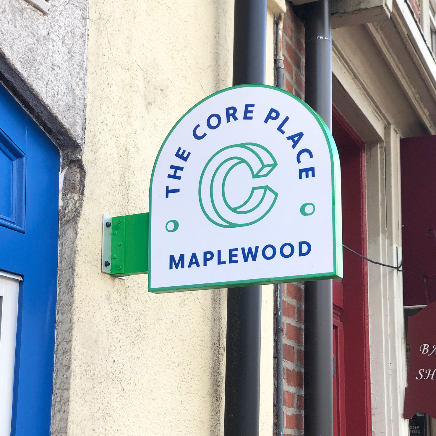
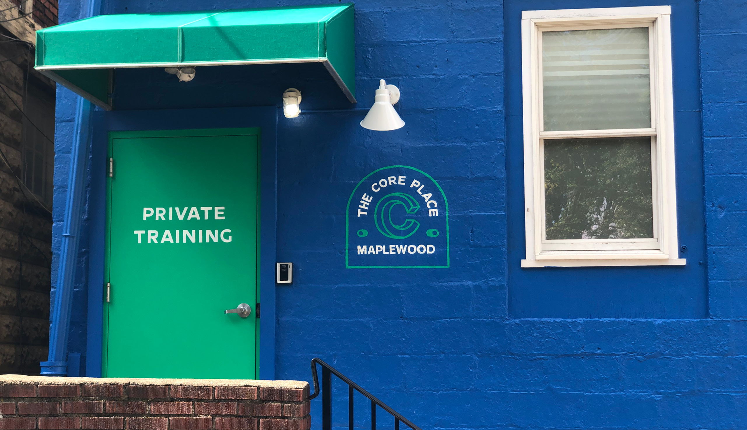
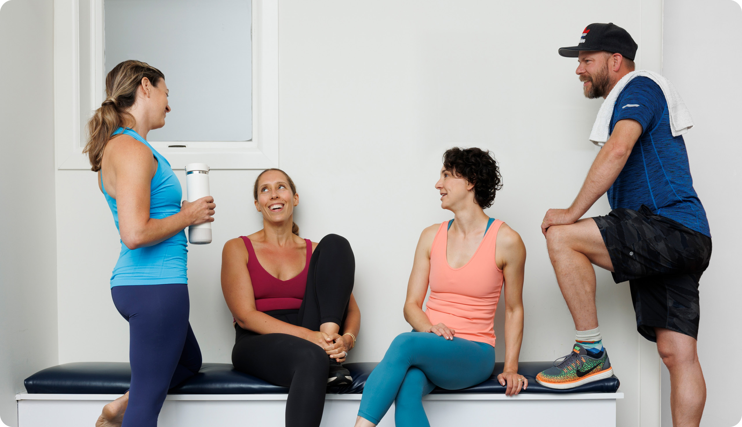
Primed to dispel the intimidating exclusivity often associated with boutique, niche fitness studios, we developed a friendly, approachable brand identity that highlights the personal touch and community atmosphere of The Core Place without compromising on its posture of expertise.
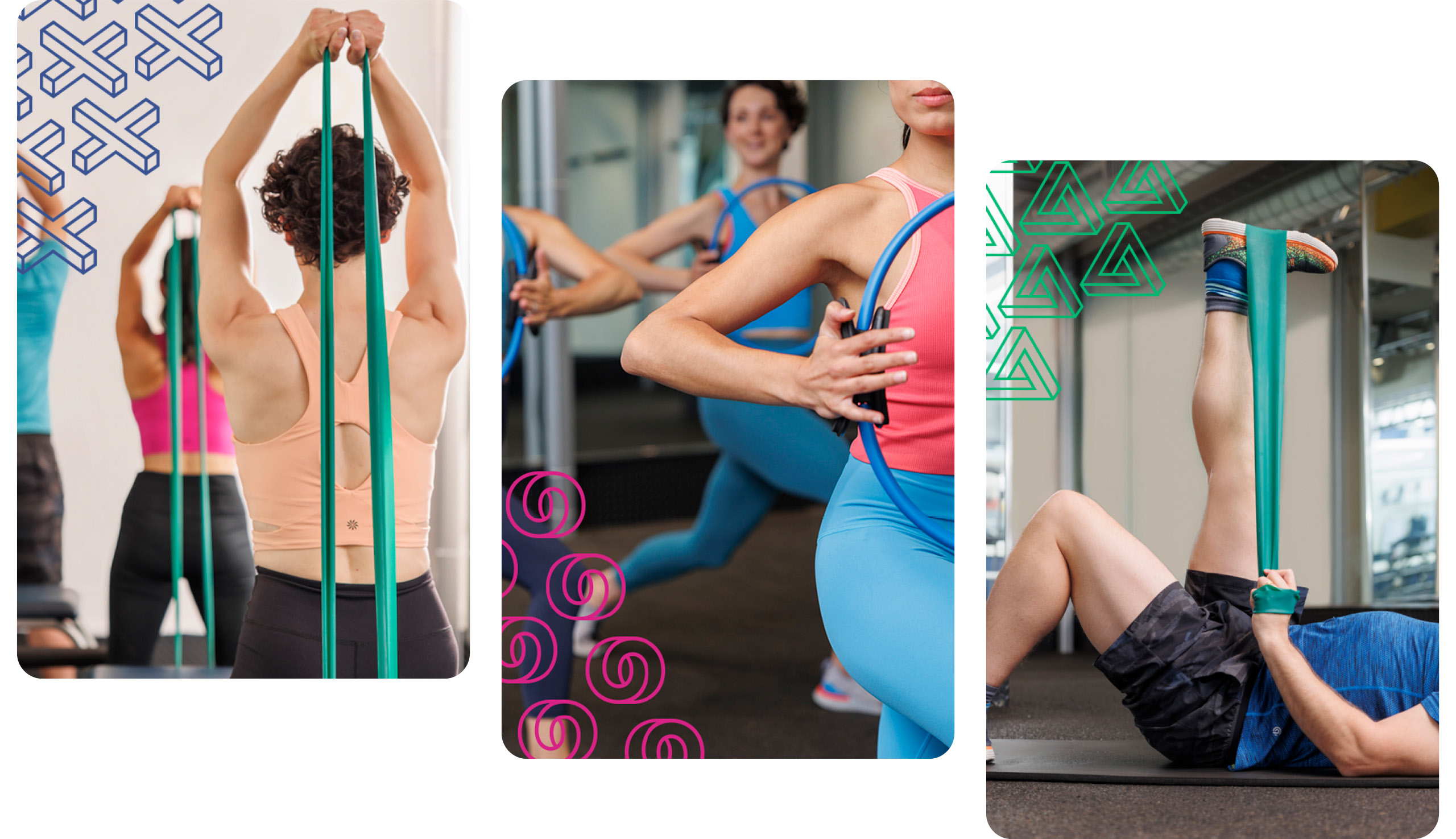

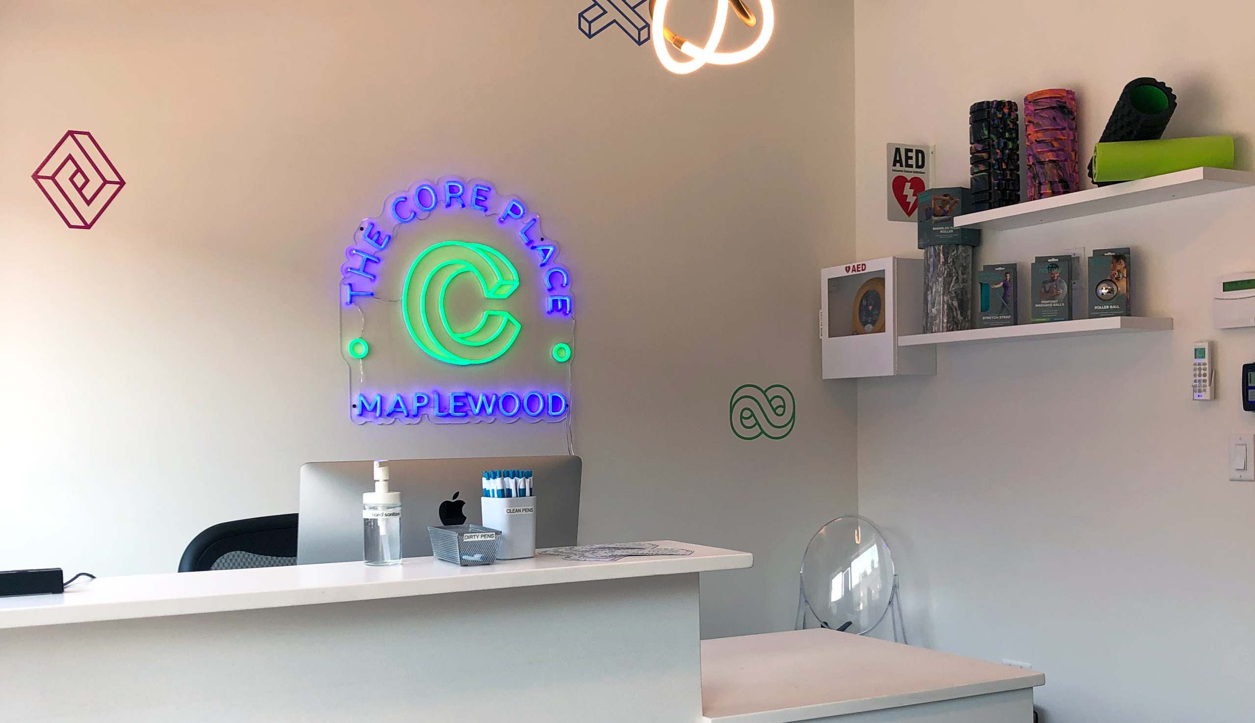
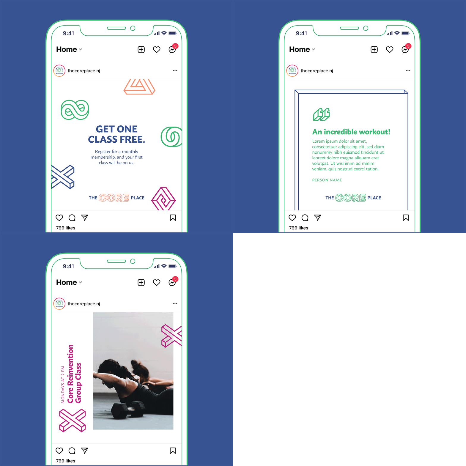
Dynamic, bright & strong.
The deep understanding of the many sides of mind-body maintenance that grounds the studio comes through most notably in the dimensionality of the logo and iconography, while the pops of color add an energetic finishing touch.

We had a great time working with the team at 7 Layer Studio. They created a great new look for our rebranded business. They understood our needs and were able to introduce us to a new look that was surprising and has been very well received by both our existing and new clients. We learned a lot about having a consistent and cohesive message across different marketing strategies. We love our new look!
— Felix Aarts, Studio Manager of The Core Place
