

The CannaBoss Lady
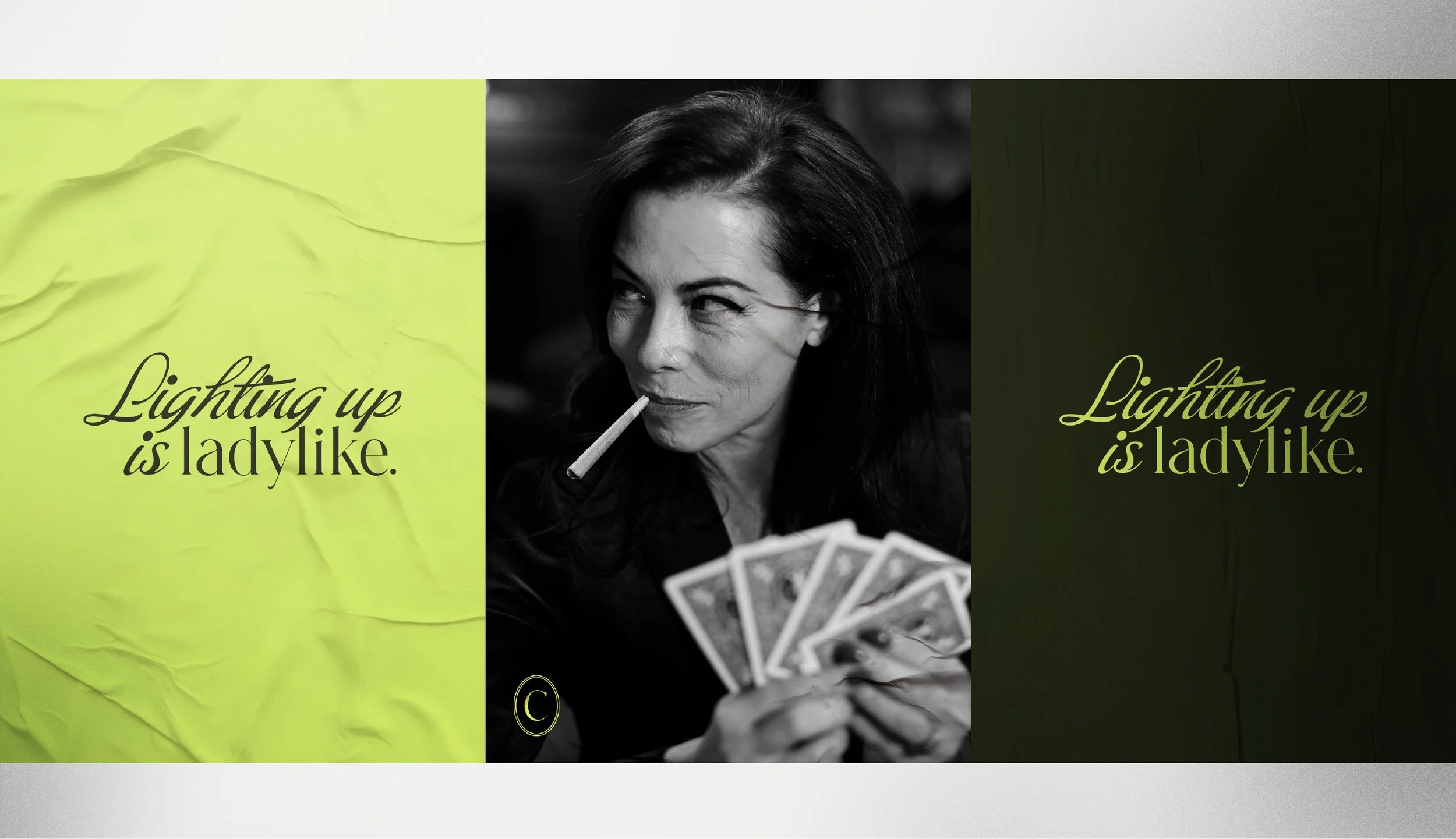
Lighting up is ladylike with the CannaBoss Lady’s pre-roll line
The CannaBoss Lady curates a cannabis experience to help you feel better, look better, sleep better, and have a little fun. With success stories that'll make your mom blush... and then come back curious. When founder Jill wanted to expand her business from a local dispensary and CBD shop to include a cannabis line, she needed to evolve her brand. The goal was luxe, edgy and feminine — an ode to the pretty little plant that's been stirring up drama for decades.
Scope
Visual Identity Evolution
Verbal Identity
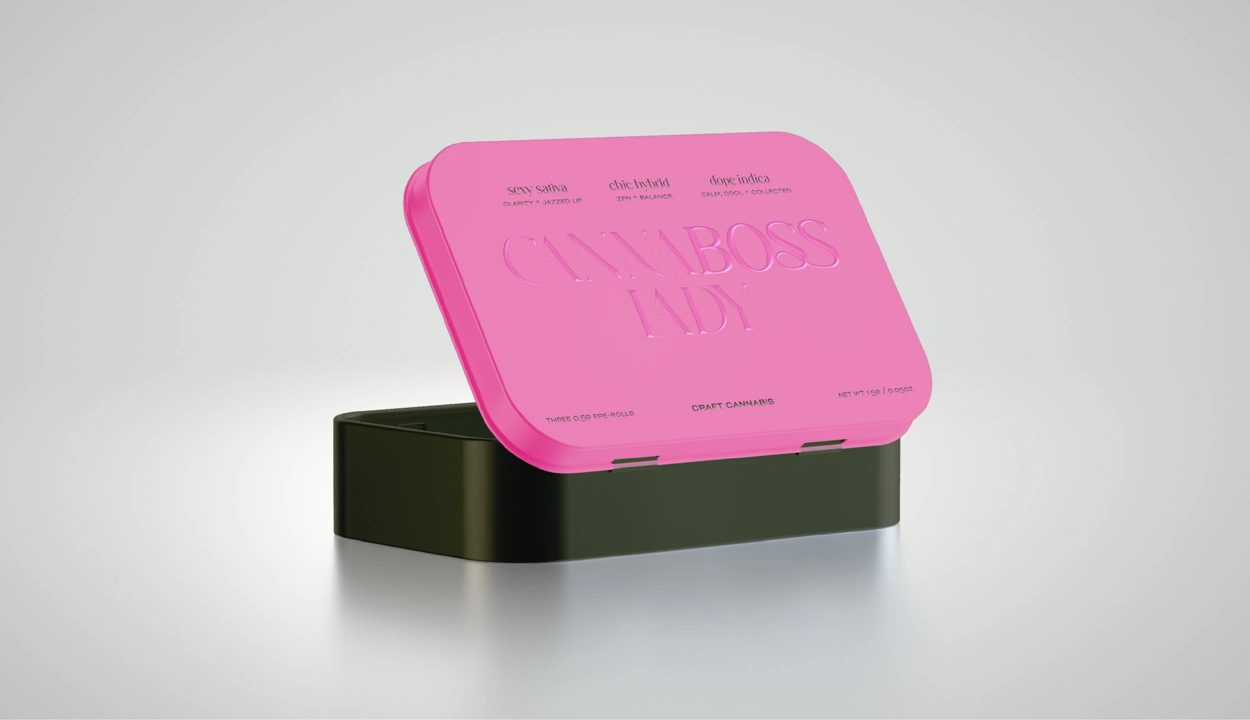
Packaging
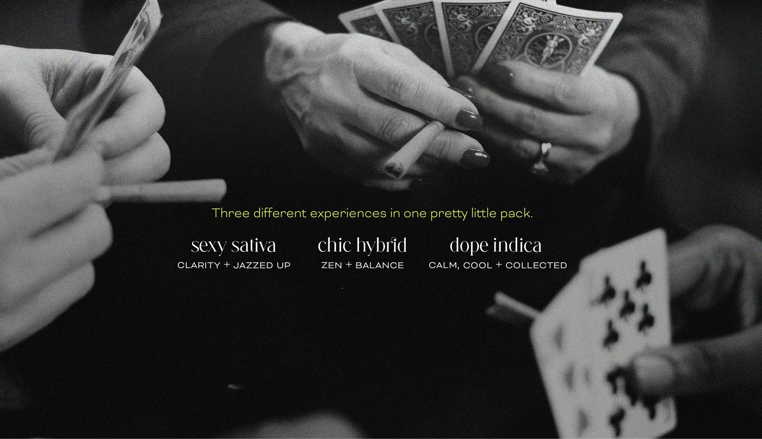
Photography Concept
Credits
Photography: Chris Thaler
Starting by identifying the core brand values that make up the CannaBoss Lady’s unmistakable personality, we developed a tone of voice that is confident, edgy and cool.
We built a verbal identity system that is unapologetically feminine and not afraid to cross the line — because lighting up is ladylike.
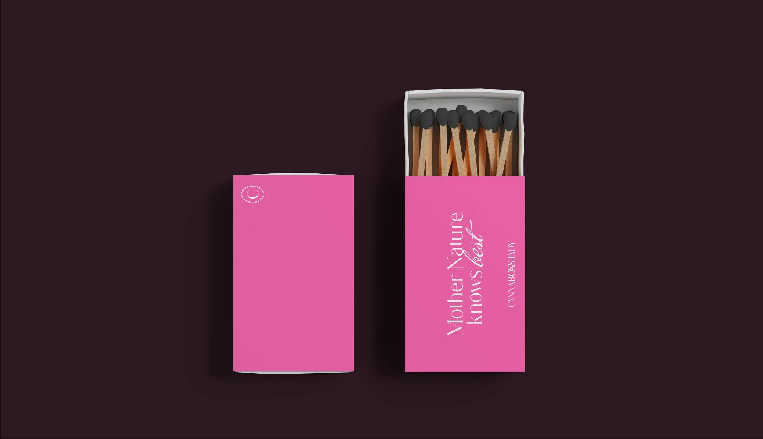
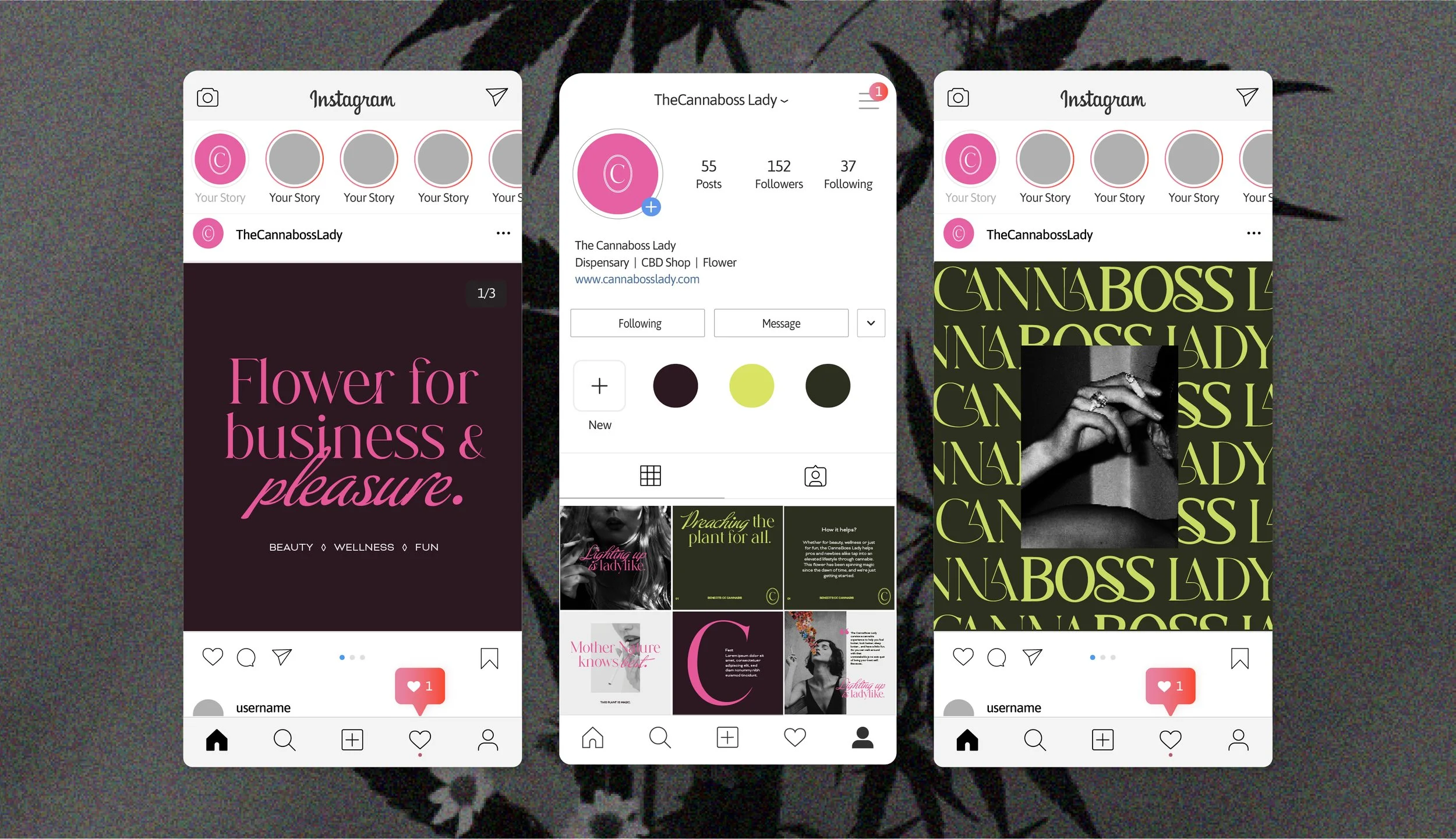


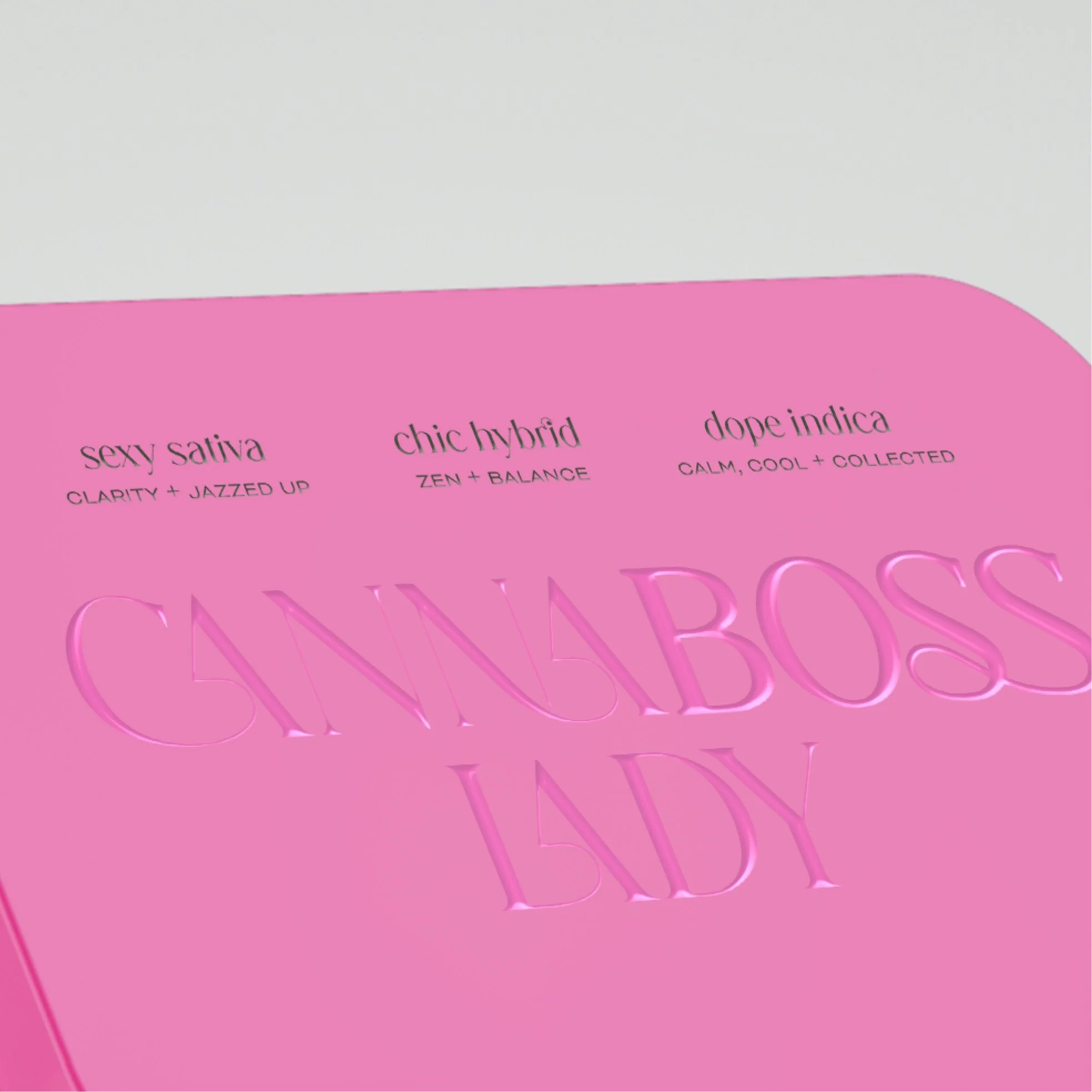
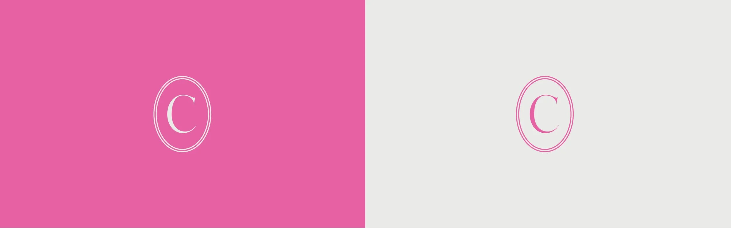
We infused the color palette with rich, deep jewel tones contrasted with pops of bright pink and green, and paired the brand’s existing serif with an elegant script. Working with the existing wordmark, we extended the logo suite to included a brandmark inspired by a classic monogram seal.
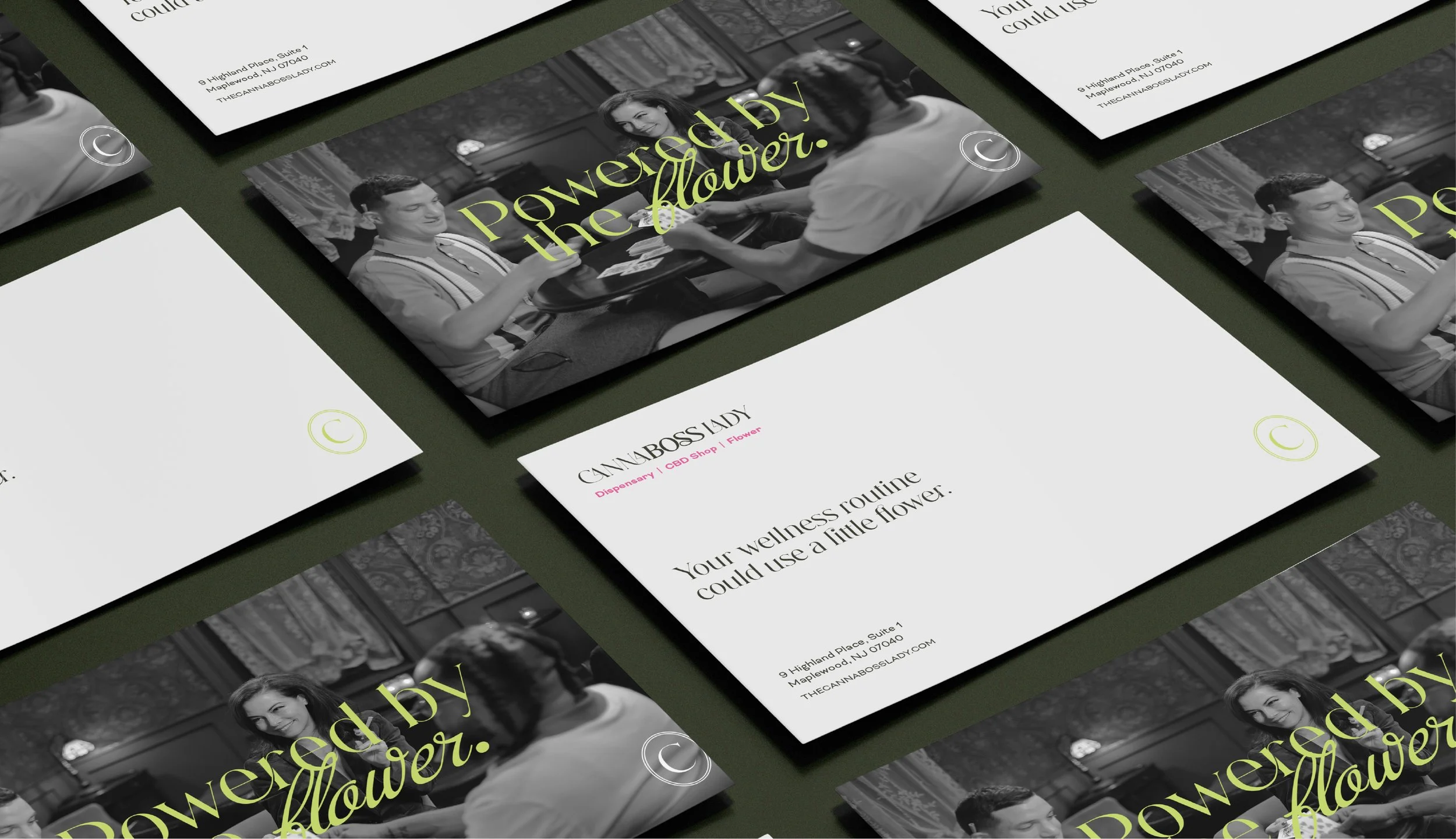
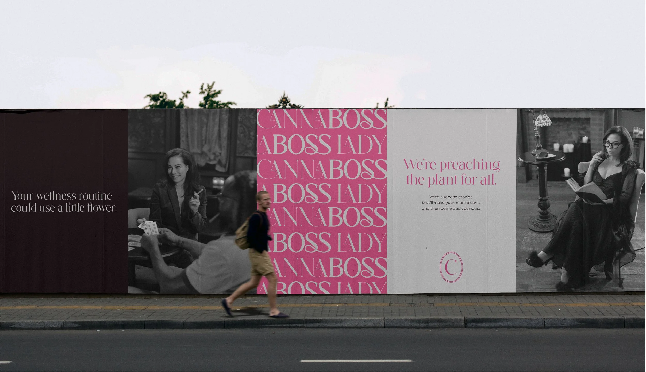
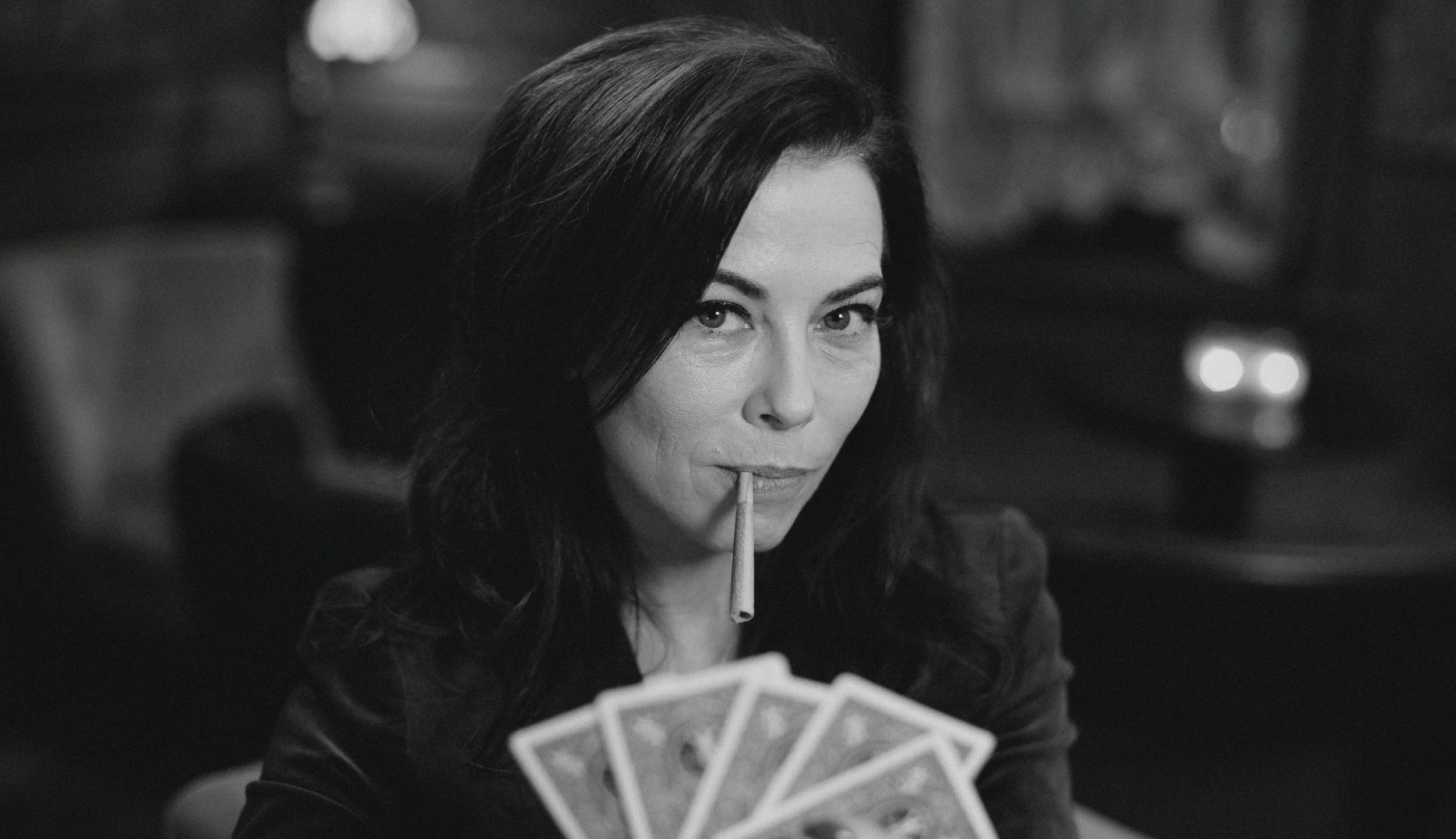
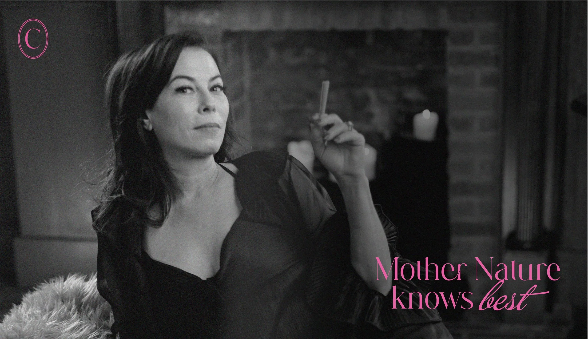
Drawing inspiration from Old Hollywood glamour, the visual identity features black & white photography of the CannaBoss Lady herself. An icon of cannabis for wellness and for fun, she knows that women can do it all, but it's a lot easier with a little flower.


